

Vape and e-cigarette brands
Vape brand ad shots: the creative that survives where nicotine is allowed
A vape brand lives in a strange spot for creative. The product is legal for adults in many markets, the hardware photographs well, and the flavour line-up is made for a poster. At the same time the two biggest paid channels treat anything in the nicotine family as a restricted or banned category, so the brief has to be written for the surface, not just for the brand.
Build a vape product still from your device photo. You see the plan and the price before anything is generated.
This is a shot map for an adult-audience vape or e-cigarette label. It covers what to generate for your own store, email and marketplace listings, what the ad platforms actually allow, and where the line sits so you do not burn an ad account finding it. Blurbly will build device stills and lifestyle shots of the product. It will not target minors, and it will not write copy that makes a health claim. Neither should you.
Blurbly editorial · · 6 min read
Own the surfaces the platforms do not control
Meta does not allow ads for tobacco products, and it folds e-cigarettes, vapes and e-liquid into that same tobacco policy. TikTok bans ads for tobacco and related products too, and most self-serve markets read vape cartridges and devices as covered. There is no certified-advertiser path for vape on either platform the way there is for CBD on Meta. That means the paid-social plan for a vape brand is essentially zero, and the creative budget belongs somewhere else.
Somewhere else is real: your own storefront, marketplace listings where they are permitted, email to age-verified subscribers, in-store screens, wholesale sell sheets, and the product packaging itself. A sharp packshot and a flavour poster move the needle on all of those. The mistake is writing one creative brief for every surface. Write a clean packshot set for listings, a lifestyle set for your own site and email, and keep anything that looks like a lifestyle ad off the paid channels entirely.
The packshot is your main image, so make the device legible
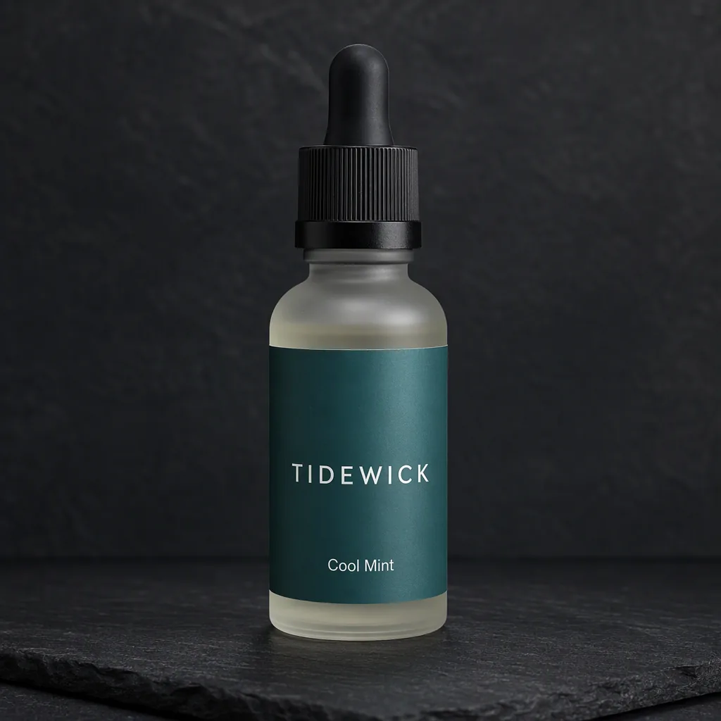
Start from the object. A vape device is a small piece of industrial design: a mouthpiece, a body, maybe a screen, a charging port, a colourway. The main image is the device standing or lying at a three-quarter angle on white or soft grey, next to its box. Keep the brand mark on the device and the box readable, because a buyer scrolling a listing grid is comparing shapes and finishes, not reading.
Upload the sharpest front photo of the real device you have. Generators invent small type, so the flavour name and the nicotine warning on the box can come back as plausible-looking nonsense. Check every label before the image goes live. The vape product photos page shows the studio, white-background and lifestyle set we generated for a fictional device, with the same label-check problem called out.
Flavour is the story, and the poster is where it lives
Nobody buys a vape for the battery. They buy mango ice, mint, tobacco, lychee. A flavour line-up poster is the hardest-working still a vape brand owns: the pods or bottles in a row, each band coloured to its flavour, with one ingredient cue per SKU such as a mint leaf or a mango wedge. Keep the cue next to the product, not behind it, so the crop still reads when it shrinks to a phone.
Flavour naming is also where the compliance line quietly sits. Names and art that read as candy, cartoons or youth culture are what regulators in the US and UK have repeatedly gone after, and they are what make an otherwise legal product look aimed at teenagers. Adult skewing flavour art is fruit, ice, botanicals, metallic and minimal. If a generated poster invents a cartoon mascot or bubble-gum lettering, cut it. That is not a style choice, it is the difference between a product page and a warning letter.
Lifestyle shots: night adult spaces, no vapor tricks
The lifestyle frame for a vape product is an adult space where the device belongs: a bar counter, a studio desk, a car console at night. The device sits in the scene as an object, the way a lighter or a watch does. A hand can hold it. What the frame should not do is make the exhale the subject. A huge cloud reads as use glorification, and it is the first thing a marketplace reviewer or a platform scanner flags.
For your own site you have more room: a slow pour of vapour in a short clip can work as texture on a homepage banner, because you are not buying an impression next to a policy. Even there, keep people fully dressed, clearly adult, and keep the device identifiable. If you want motion for the listing or the site, a product photo to video pass animates the still without inventing a scene the brand did not ask for.
Marketplaces and payment processors are a second review
Platforms are not the only gatekeepers. Amazon does not sell vapes at all. Most independent-store platforms allow them but route you to specialty payment processors, and those processors review your site before they board you. The site they review is built from exactly these assets: packshots, flavour posters, age-gate notices, the shipping policy. Clean, adult-register product photography is part of what makes a store look boardable.
Where marketplaces do permit vape-adjacent products, accessories and empty hardware in some regions, their image rules read like the strict version of everything above: white background, no props that imply use, no vapour, no people. Keep one listing-compliant version of every packshot with nothing in frame but product and box, and you never have to scramble a reshoot for a channel that asks.
Email and wholesale do the heavy lifting
The channels that actually grow a vape brand are boring on purpose. Age-verified email is the highest-margin one, and it eats creative faster than any other: a flavour drop announcement, a restock, a device comparison, a coil or pod compatibility chart. A folder of clean stills means every send has a real image instead of a screenshot of the last campaign.
Wholesale is the second engine. A vape shop buyer decides from a sell sheet: line-up poster, per-SKU packshot, case counts, margin. That is a PDF assembled from the same six images below, plus one photo of the shipping case. Brands that look organised in the sell sheet get shelf space; the photography is most of what organised means at that stage.
What the ad platforms will not run, whatever you do
Meta groups vapes, e-cigarettes, e-liquid and related accessories under its tobacco policy, and tobacco ads are not allowed. There is no LegitScript-style exception for nicotine devices the way CBD has one. TikTok prohibits tobacco product ads and most markets read vape hardware and juice as inside that ban. Nicotine pouches sit in the same policy bucket in most readings, so do not plan a workaround around the format.
The practical consequence: do not brief Meta or TikTok creative for a vape SKU at all. Accounts do get restricted for repeatedly pushing a banned category, and an agency that says otherwise is spending your account health. Spend the creative budget on the surfaces above, and if you need traffic, retail partnerships and age-verified email are the channels this category actually runs on.
A six-image set a vape label can use this week
One: device and box at three-quarter angle on white, the listing main image. Two: device alone on the brand colour, the hero. Three: flavour line-up poster, pods in a row with ingredient cues. Four: device on a bar counter at night, adult hand blurred behind, your own-site lifestyle. Five: a hand holding the device with the LED visible, for email and sell sheets. Six: the box flat lay with pods arranged around it, the wholesale shot.
All six come from one decent photo of the device and the box. Keep every label readable, keep every human clearly adult and clothed, and keep the nicotine warning that your market requires in the frame where your packaging really carries it. The vape ad policy notes collect the platform rules in one place if you want the sources before you build.