

Men’s underwear brands
Men’s underwear brand ads: the waistband, the thigh, and the crop you refuse
Women’s lingerie has a shelf of advice. Men’s underwear has a meme and a celebrity waistband. If you sell trunks, briefs or boxer-briefs, the search results will not tell you how to frame an adult male model so the cloth is the subject. They will tell you to “be confident” and show you someone else’s campaign you do not have the rights to copy.
Make a men’s underwear still about the garment. You see the plan and the price before anything is generated.
The craft is dull in the best way. Pouch shape, leg length, waistband width, rise, and whether the fly is a fly. The charge, if you want it, comes from a close torso in hard side light, and it is the first thing you should take out of a paid ad. This is that split, for brands selling men’s underwear to adults.
Blurbly editorial · · 6 min read
What the buyer is trying to see
A man buying trunks wants the leg opening, the rise, and whether the pouch is shaped or flat. A man buying a long boxer wants to know if it is actually long. None of that survives a crop that is only pectorals and a waistband floating at the bottom edge. Shoot the garment the way you would shoot a trouser: enough body to understand drape, enough cloth to understand the pattern. The men’s underwear product photos page is the packshot version. Campaign frames still owe the buyer those three facts.
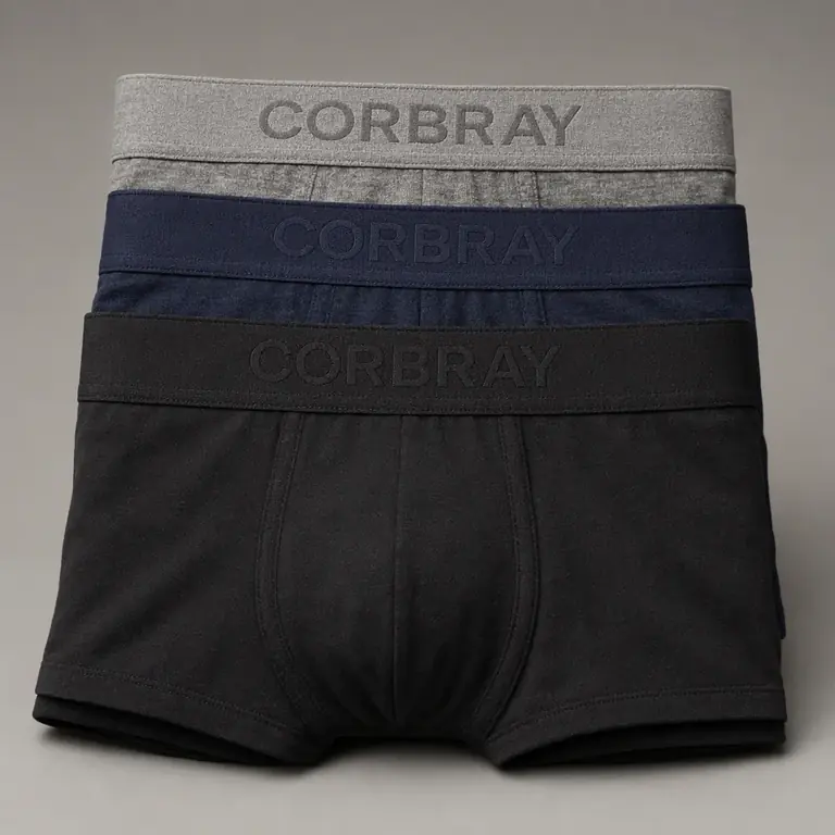
Name the rise and the leg in the brief or the generator will guess a fashion trunk when you sell a mid-length boxer. “Short”, “mid-thigh” and “knee” are different products. Colour shifts under gym lighting, so keep one daylight studio frame as the reference for black versus charcoal. A logo on the waistband is small type. Expect it to blur or respell. If the wordmark matters, composite the real waistband artwork onto a frame you have already checked, instead of hoping the model draws your letters.
Studio, gym and the overshirt
Studio is the picture a wholesale buyer can use. Say “plain light grey wall, soft front light” and stop there. The backdrop does not need a slogan. Full length, weight on both feet, hands relaxed. Then a waist-to-knee frame where the waistband is level and the leg hems are both visible. That second frame is the one that sells fit. It is also the frame that becomes obscene if the camera drops and the pouch is the focal point. Keep the focal point on the waistband stitching or the leg hem. If your eye goes to the crotch first, reshoot from higher or wider.
The gym frame is a context, not a thirst reel. An open overshirt or a tee pulled up only far enough to show the waistband, in a real gym aisle, reads as “what he wears to train”. A shirtless flex with the camera below the navel reads as something else, and it throws away the fit information. Sweat on a shoulder is texture. Sweat plus a hand on the inner thigh is a pose. Use the overshirt when you want the file to be eligible for more than your own website. The fashion model generator is the right tool when you need the same cut on more than one body. Men’s fit varies at the thigh as much as women’s fit varies at the hip. One model is a look. Two models is a size story.
The torso crop is the edge, and it is usually the mistake
A torso from neck to upper thigh, lit from the side so the waistband catches a highlight, is the shot every men’s brand saves to a mood folder. It is charged because it is close and because skin is doing a lot of the work. Use it once, on the lookbook cover, and only if the garment’s leg and waistband are still readable. Do not make it the ad. Meta’s nudity rules treat imagery focused on the groin as sensitive even when it is covered. TikTok’s adult content rules treat emphasis on sensitive body parts, and underwear that implies exposure, as not allowed. A low hero shot of a pouch is exactly that emphasis. You will not win the argument in the appeal box.
Hands are the other tell. Hands at the sides, or hooked lightly in a pocket of an overshirt, look like a person. Both thumbs inside the waistband, pulling it away from the body, looks like undressing. TikTok names undressing. Do not brief it, and do not “just try it” in a generator. Blurbly’s policy bars sexual content and nudity. A refused frame is the correct outcome for a groin-led prompt. Rewrite toward the hem and the waistband. The men’s underwear ad policy page has the platform wording. Read it before you art-direct a calendar.
Copy that sounds like a fit note
“No ride, no gap” is a claim you must be able to support, and a generated photo cannot support it. Put those words in the product description only if wear-testing said so. In the ad, say the leg length, the rise and the fabric: “mid-thigh, 9 inch, modal”. That line does more for a cold buyer than any joke about what is underneath. Jokes about the body are how a men’s underwear ad gets classified as suggestive when the picture was fine. If you want a wink, wink at the cloth: the waistband that does not fold over, the black that stays black after a wash.
Video, if you make it, is a turn and a walk of five seconds. Front, side, back, so a buyer sees the leg in motion. No slow push from the belt down. No mirror selfie with the phone covering then revealing. The UGC ad generator can hold a creator-style frame if the creator is an adult and the action is “show the waistband and the leg”. Give the creator a script that is the fit note out loud. A script that is a dare will not get easier to approve because the person is holding a phone.
Colourways, packs and the picture you repeat
Three-packs are a layout problem. Do not ask for one model wearing three colours. Lay two folded and one worn, or three worn on three models with the same pose and the same grey wall. The repeated pose is what makes a pack look like a pack. Changing the pose per colour makes a lookbook and hides the difference in dye. Black, charcoal and navy need more exposure than a generator’s default. If they collapse into one dark shape, the frame is useless even if the body looks good.
Say whether there is a fly, a contour pouch, or a flat front. Those are construction, and construction is what a buyer zooms in to check. A generator that smooths the front into a fashion illustration has failed even if the image is handsome. Compare against the sample on a table, not against the mood you had in your head. The edgy brand ad shots page includes this category next to lingerie and swim, so you can see the shared mistake: cropping until the product is a rumour.
A five-file launch that a buyer can forward
Pretend the first recipient is a store owner who will skim this on a phone in a stockroom. Every file has to explain itself without your caption.
- Folded packshot of the trunk, waistband open so the inside elastane is visible.
- Full-length studio stand, overshirt off, front light, both leg hems sharp.
- Waist-to-knee, camera at waist height, focus on the waistband stitch.
- Same pose on a second body type if you sell above and below a large thigh.
- Five-second turn, front to side to back, no music with sexual lyrics. Ads use files one through three. The lookbook may add a single side-lit torso only after those three exist and match the sample.
Who you may not put in the picture
Adults only. No “college guy” styling that reads as a teenager, no locker room of minors, no real athlete’s face unless you have a license and a release that mentions synthetic images. A fan wearing your trunk in a photo they posted is not a release. Blurbly will not place a real person into underwear. Use a library adult or a model who signed.
If the brand tone is erotic rather than apparel, you are in a different business from the one Meta, TikTok and ordinary processors want. Keep that material off the product page you send to Shopping, and do not ask a product tool to make it. The apparel version, shot with discipline, already looks more expensive than a flexed torso. Buyers who care about a 9-inch leg can tell you did the work.